
This is the sixth in a series of blog posts highlighting the digital literacies our students will need to succeed. This post will provide you with some ideas on how to infuse data literacy skills into the curriculum.
According to Dr. Milo A. Schield, students must be able to read, interpret and evaluate information. They must also be able to analyze, interpret and evaluate statistics. And they must be able to gather, assess, process, manipulate, summarize, and communicate data.
These three skills collectively comprise data literacy.
These three skills collectively comprise data literacy.
One way to have students gain the data literacy skills is the student creation of an infographic as a creative assessment. This assessment process includes practice with the information, visual, and computer tool literacies, too.
An infographic is a visual representation of data that allows the viewer to understand a topic, get another view, or persuade them to research further.
In the Newspaper Designer’s Handbook, a McGraw-Hill publication by Tim Harrower and Julie Elman, they provide some thoughts on why one might use an infographic. They are writing about infographics to enhance a news story, but the same ideas are applicable to student-created infographics to support a research project.
- To complete the “story” for those who are interested
- To draw in viewers from those that might skip the information
- To pull out salient numbers, details, and comparisons
- To clarify with statistics, geographical detail, or trends
- To help insure the viewer “gets it”
Infographics fall naturally into categories such as statistical infographics, timeline infographics, process infographics, and research-based infographics.
STATISTICAL INFOGRAPHICS
Statistical infographics contain an overview of a topic and data to support the content. These infographics are used to either inform or persuade.

Statistical infographic
For elementary students, showcasing statistical infographics which use size to indicate the different percentages instead of numbers would be easier for them to replicate.
For elementary students, showcasing statistical infographics which use size to indicate the different percentages instead of numbers would be easier for them to replicate.

TIMELINE INFOGRAPHICS
One way to get students “hooked” is to showcase infographics that engage them, like this timeline infographic that tells a story.
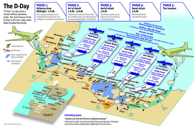
Timeline infographic 2
PROCESS INFOGRAPHICS
A process infographic is a little different from a timeline. The creator adds a branching component to the visualization. A process infographic could be used when students are creating “how-to” essays. The infographic can be created by the student writing the essay, or a partner student can design the infographic from the essay.
RESEARCH-BASED INFOGRAPHICS
One of my favorite types of infographics is the research-based infographic. Students are given a sum of money and have to conduct research to determine how to raise those funds. Snagajob.com published the infographic below and, although they did not include where the data was found, they did include fairly comprehensive overviews of how they determined the statistics.
Here is the explanation for one of the items included in the infographic above: “Peyton Manning makes $14 million per year. Super Bowl notwithstanding, in the 2009 regular season he completed 4,500 passing yards (totaling 162,000 inches). If you divide his salary by the number of passing inches, he would need to pass the ball a little more than 8.4 inches to make $729. And just in case you’re wondering, a football is 11” long.”
There is a new series of research-based infographics called “If the world were a village of 100 people” created by Toby Ng. These data-based infographics are simple and informational, but are very compelling.
DATA VISUALIZATION
To learn how to process data, students should view already-created visualizations and discuss how and why the data is presented the way it is and its relevance.
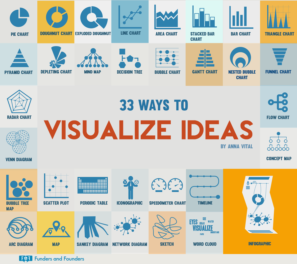
This great infographic provides an overview of some visualization options.
One good place for teachers and students to learn how to pick the most effective visualization for the data is Hans Rosling’s Gapminder site. The Gapminder site has a teacher area with samples, ideas, and curriculum to support the teaching of these skills. There are instructional videos and PDF downloads for both teachers and students.
Another site to support students learning how best to visualize data is Google’s Public Data Explorer.
CREATING THE INFOGRAPHICS
There are many apps and tools that can help students create their infographic. Something as simple as a Microsoft PowerPoint, Apple Keynote, or Google Drawings single slide or page can be used. Once the infographic is created on a single slide, the slide can simply be saved out as an image and easily shared.
There are many online sites that provide templates for infographic creation. Some are paid sites that provide a few free templates. However, according to Eric K. Meyer, the author of what I consider the best book about infographic creation, a good infographic should have a beginning, a middle, and an end. He likens the visual elements in an infographic to those in a new story’s headlines and lead.
In addition, he goes on to state most readers skim both text and images rather than reading them, so a well-crafted visual image at the top of the infographic may just be the hook the viewer needs to stop and take the time to read and look at the information in the infographic. He talks about the way people read an infographic as an inverted pyramid style with the main point at the top followed by secondary points and supporting details. He also states any text in the title of the graphic should communicate facts rather than just label the information.
The templates offered by the online infographic creators do not often follow this tenet. Infographics need “weight” so the viewer knows what is most important. Many infographics I see are simply posters, with all the information equal in weight. Since an infographics is intended to inform or persuade, there does need to be a “hook” so the viewer will examine it in depth.
What is useful about the online infographic-creation sites is that a student is able to start the infographic from scratch and many, many graphical assets are included. Some of these tools even have the ability to input data directly into the tool and pick an appropriate data visualization for the project.
Online infographic creation sites
Tablet apps for infographic creation
- iVisual Info Touch Lite (iOS) (Android)
- GlogsterEDU for iPad
- Canva for iPad
You can find much more information, samples, ideas, and tips on my Kathy Schrock’s Guide to Everything: Infographics page. Here is a quick video overview!
What do your students use for creating infographics? What type do they create most often? Let us know on Twitter! #kathyschrock